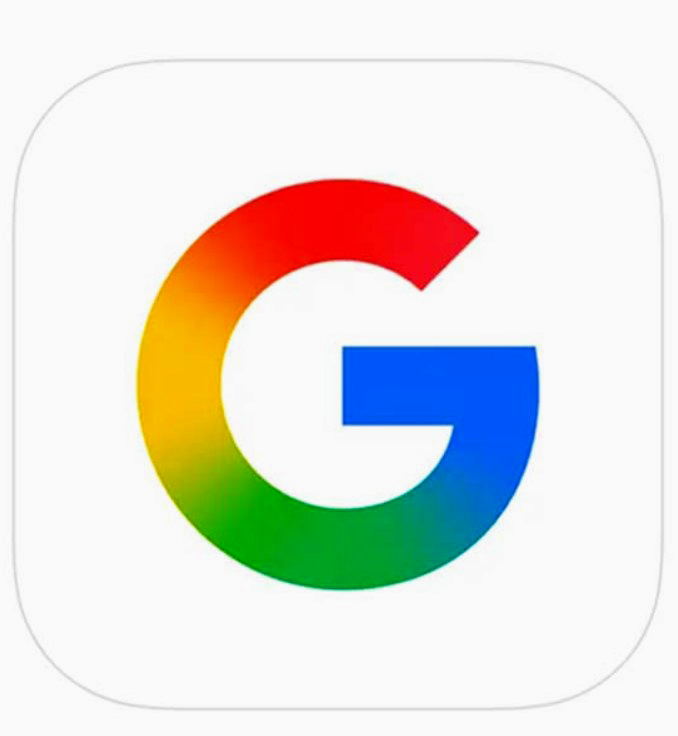
Meta Description: Discover Google’s latest logo transformation: a gradient ‘G’ symbolizing its AI-driven evolution. Explore the design changes, rollout details, and the brand’s visual journey.
Google Unveils New Gradient ‘G’ Logo in First Redesign Since 2015
Table of Contents
- Introduction
- Evolution of Google’s Logo
- The 2025 Gradient ‘G’ Logo
- Design Philosophy and AI Integration
- Rollout and User Reception
- Comparative Analysis: 2015 vs. 2025 Logo
- Implications for Google’s Brand Identity
- Conclusion
Introduction
In a clear indication that Google’s identity is continuing to evolve, the company has changed its beloved ‘G’ logo for the first time change in nearly ten years. The redesign transforms the logo segments from solid colors to gradient colors and coincides with the company’s priority on artificial intelligence (AI) and updated design aesthetics.
Evolution of Google’s Logo
Google’s logo has undergone several transformations since its inception:
- 1997: The original logo, created using GIMP, featured a simple design.
- 1999: Ruth Kedar introduced a more refined logo using the Catull typeface, incorporating primary colors.
- 2010: A subtle redesign adjusted color tones and shadows for a cleaner look.
- 2015: Google adopted the sans-serif Product Sans font, presenting a modern and versatile logo suitable for various devices.
The 2025 Gradient ‘G’ Logo
The latest redesign focuses on the standalone ‘G’ icon:
- Gradient Effect: The new logo features a seamless transition between red, yellow, green, and blue, replacing the distinct color blocks.
Modern Aesthetic: This change offers a more contemporary and dynamic appearance, reflecting Google’s innovative spirit
Design Philosophy & AI Integration
The gradient design is consistent with Google’s wider focus on AI
• Visual Consistency: The new ‘G’ has the same gradient aesthetic as the Gemini logo, so it creates visual consistency and the same language across products.
• Represents Fusion of Innovation: The liquidity of the gradient represents seamless integration of AI into Google products as we continue to innovate.
Rollout and User Reception
The new logo has started to appear across various platforms.
• Android and Web Products: The rollout is expected to impact more devices and services in early 2024.
• iOS and Pixel Devices: Users have recognized the new ‘G’ icon on the Google app on iOS (Google iOS app) and on the Google phone app, which will be everywhere soon.
User response has indicated that users are liking the new design and it’s a modern polished design.
Comparative Analysis: 2015 vs. 2025 Logo
| Feature | 2015 Logo | 2025 Logo |
| Color Segmentation | Distinct solid color blocks | Seamless gradient transitions |
| Typeface | Product Sans | Product Sans |
| Design Style | Flat design | Gradient-infused design |
| Visual Impact | Clear and bold | Smooth and dynamic |
Implications for Google’s Brand Identity
This redesign is more than an update:
• Embracing Change: The gradient ‘G’ represents that Google is keeping pace with technological change.
• Consistency in Branding: Google utilizes the ‘G’ logo in its existing designs to provide customers with a complete brand identity.
• User Interest and Innovation: Google’s new logo is a great way to remind users of the company and show that they are still innovating.
Conclusion
Google’s introduction of the gradient ‘G’ logo is a thoughtful evolution of its brand identity; blending contemporary design practices and its longstanding identity, Google continues to be a leader in technological innovation.
SEO Keywords: Google new logo, Google logo 2025, Google gradient logo, Google ‘G’ redesign, Google AI branding, Google logo evolution, Google logo update, Google branding 2025, Google logo change, Google design update
![]()

